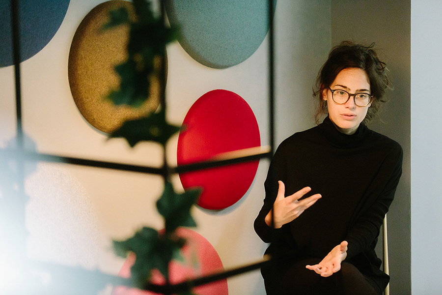
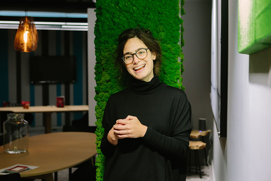
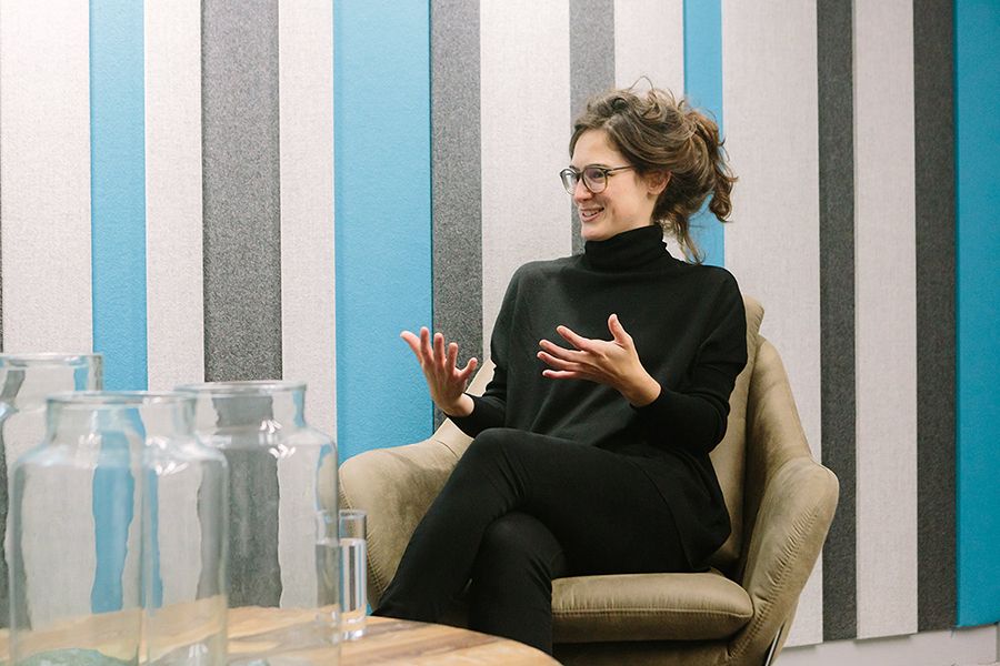
Rosie Haslem is a Director at Spacelab, a research, interior design and architecture practice that has a strong focus on making buildings that fit people, instead of trying to fit people in to buildings.
Creatif spoke to Rosie about Spacelab’s people-focused approach to designing space – especially at a time when technology is pioneering a new way of innovative engagement and conceptualisation for clients – acoustics, the science of space, unlimited holidays and why Barcelona is a constant source
of inspiration.
Creatif: You’ve been a visiting lecturer at the Bartlett School of Architecture, UCL for the past six years, lecturing on the social science of space. Can you explain this, and how you got there?
Rosie Haslam: I’ve been lecturing on the ‘Space Syntax: Architecture and Cities’ Masters course since I graduated from it, back in 2011. My undergraduate degree was in Human Geography, and I had always been fascinated by cities. I was interested in how the city is structured, how people use it, and why things happen in certain spaces [such as] urban layout, development, growth, and change.
I knew I wanted to work in this area but couldn’t quite work out what a job would look like. I then found the Masters course at the Bartlett. This was all about a social, configurational theory of space – about spatial layout and how things connect, and how that then influences people’s movement and their flow through the city. This ‘science of space’ is underpinned by qualitative theory and quantitative analysis.
Whilst I started the course with a focus on the urban scale, half of the modules were about architecture, and so I also learned about how socio-spatial relations play out at the building scale. My lecturer, Dr Kerstin Sailer, who heads up that side of the course, had done a Knowledge Transfer Partnership with Spacelab many years ago, carrying out her PhD research on the practice’s live projects and also developing methods which became the initial basis of Spacelab’s research-driven approach to design.

Through her lectures I was inspired to go and work at Spacelab and apply the course’s theories to real life projects – to help create spaces that really work for the people who use them.
Creatif: How does the science of space work and how does it influence people?
RH: Our people-first approach to design is underpinned by the science of ‘space syntax theory’, which is essentially about how visibility encourages movement and connectivity.
Many of our clients face the problem of a siloed workforce and ask us to help break this down. People tend to move where they can see, so spaces which maximise visibility and long lines of sight will have greater connectivity and potential for movement. We use various spatial analysis tools to map the visibility and connectivity of space, and to model how we can make various interventions or changes to optimise these.
We’re also interested in the social science of organisations as communities. We run social network analysis to understand how relationships work – or do not really work – across an organisation, and to identify where space can help to bring people together. Through careful consideration and placement of spaces for interaction, we can enable greater inter- and intra-team collaboration and knowledge transfer, which in turns empowers people, as there is increased understanding and empathy across a business.
Where people tend to sit in relation to other colleagues also plays a key role in helping, or hindering, cross-communication. For example, at Spacelab, we have about 50 people across various departments and disciplines but don’t have any allocated desks or even allocated zones.
I’m part of the design research and strategy team, but we sit anywhere in the studio. People may choose to co-locate with a project team for a day, or with a colleague from their discipline, or just in the type of space they wish to work in at that point in time. This flexibility and agility maximise collaboration and builds strong social ties between everyone, regardless of team.
Creatif: People are usually creatures of habit. Did you notice that workers would often sit in the same place?
RH: Our studio is spread across two floors, which are connected by a central, open staircase. We have a variety of workpoints on each floor – from bench desking to sofas, and quiet booths to large open tables.
Overall things are pretty dynamic, with people choosing where to sit based on what they need to do and who they need to work with. Though of course many have preferences for certain areas, or certain types of workpoint. In fact, through noting this, we decided to do some research into how people of different personality types choose where to work.

We created some virtual environments with different workstation set-ups and asked people to walk through them in virtual reality (VR) and talk us through their preferences. We then looked at those findings in conjunction with the users’ personality profile. Whilst it is of course more nuanced than introverts preferring one type of set up and extroverts preferring another, as there are other factors at play such as the type of task needing to be done, we have started to make some interesting findings.
Introverts tend to choose positions towards the edge of a space, but with ‘visual control’ of and across that space, so they can see everything that is going on, without necessarily being very visible. Extroverts on the other hand tend to like to be positioned on major circulation routes, in the midst of things, to maximise interactions with others.
However, it was interesting to note that extroverts also liked to have the option to use closed spaces for concentrated work, as they would be likely to get most distracted in the open plan, unlike introverts who could more easily create their own focus wherever they may sit.

Creatif: How do you show your designs to your clients?
RH: We work in Revit, a piece of architectural software that enables us to design in 3D. We can immediately translate our designs from Revit into Virtual Reality (VR), which means that we can pop a VR headset on and very easily understand the full ‘experience’ of all the spaces that we are designing as we go, rather than just looking at a flat 2D floorplan.
Not only does this mean that we can make better informed design decisions internally, and thus improve the quality of our designs, but we can also show our clients, and their people – the end users – the full design as it develops.
In line with our very people-focused approach to research and design, we are able to work with the users to hone our proposals over iterative cycles of feedback and improvement.
We ask them to ‘test’ the space in terms of its functionality as well as its look and feel, to ensure that we’re solving the problems we initially set out to solve. And to create a space that will really work for those who will be using it.
Creatif: Have you noticed a trend towards acoustic consideration?
RH: Getting the acoustics right in a workplace is essential to how a space – and way of working within it – actually work. Many people fear an open plan environment either for its potential to be acoustically distracting, or on the other hand, for being so deathly quiet that nobody dares to speak aloud as they will be overheard by colleagues.
Getting the acoustics right, so that there is a good level of natural ‘buzz’, which is neither distracting nor too quiet, is therefore very important. We start building the acoustics in to our proposals as we specify the finishes, identifying opportunities to implement acoustic panels and sound-absorbing furniture where needed.
And as all workplaces are organic things, taking on a new life once they are actually lived in, we go back and check in on aspects such as acoustic comfort when we revisit our projects in post-occupancy evaluations.
Creatif: Spacelab recently won the ‘Interior Design Practice of the Year’ award. What are some of the reasons for Spacelab’s success?
RH: Spacelab has now been going for 17 years. We have always had a very people-focused approach and have always used data to drive our designs. We have also always strived to push the boundaries of what we do, to offer something different – both to our clients and to our own team. We call our studio ‘The Lab’ and we do use it as a laboratory to try new things!
In terms of our project work, over the last couple of years we have really pushed the technology that we work with, such as through harnessing VR. The benefits of this have been multiple. It transformed the design process, as well as the actual construction process – as we are able to work with contractors in a VR 3D environment.

And critically, it has also but enabled much better engagement with end-users, through our iterative cycles of design, feedback and design development.
The whole approach gives clients a much more collaborative, engaging experience of the process as well as delivering them a much more robust end product.
In terms of our internal culture, one of the things we have introduced is unlimited holiday. It just felt like a natural extension of our values to remove a ‘limit’ on annual leave and give people greater flexibility to take time off as and when they need it – within a culture of trust and team communication. People are able to take the amount of holiday that is right for them, and that also works for their project team and for the business.
The average number of annual leave days taken has increased from 25 to 32.5 days per year (excluding bank holidays), with people taking longer periods off to travel or visit family abroad, and also shorter last-minute time off to recharge.
At the same time, the number of sick days taken has decreased by 45%. We feel that giving people the freedom to take the breaks they want, and need, has resulted in a happier and more productive team.
Creatif: Finally, when it comes to physical spaces that inspire and motivate you, which country’s architecture and design has inspired you the most and why?
RH: I have always been inspired by Barcelona. So much so that I spent a year living there and wrote my Masters thesis on it! The city’s an example of how connectivity can really make or break a city.
I love both the old town and the newer, 19th century gridded extension and how they work together. There is a real logic to how the structure of the new extension was knitted into that which already existed in the medieval core, so that Barcelona would still ‘work’.
There is, however, one area of the city which became completely cut off by railway infrastructure, and this segregation led to decline. Though there are efforts to redevelop it at the moment, until its accessibility is addressed, it will struggle to become an integrated and thriving piece of the city.
So, Barcelona really is a lesson in the art of connectivity – which still influences my work at Spacelab!
Danish architecture and design is also a big inspiration. I love the simplicity of the neutral palette, clean lines and sense of space and light.